Design značky Účtovníctvo Danka Bočková bol unikátny proces, ktorý vznikol z jednej sponky.
Pri rozprávaní o novej značke som sedel v kancelárii a ohýbal som spinku v mojej ruke. Po čase ohýbania zo spinky vzniklo písmeno B, iniciála, ktorá sa stala symbolom kancelárie Účtovníctvo Bočková.
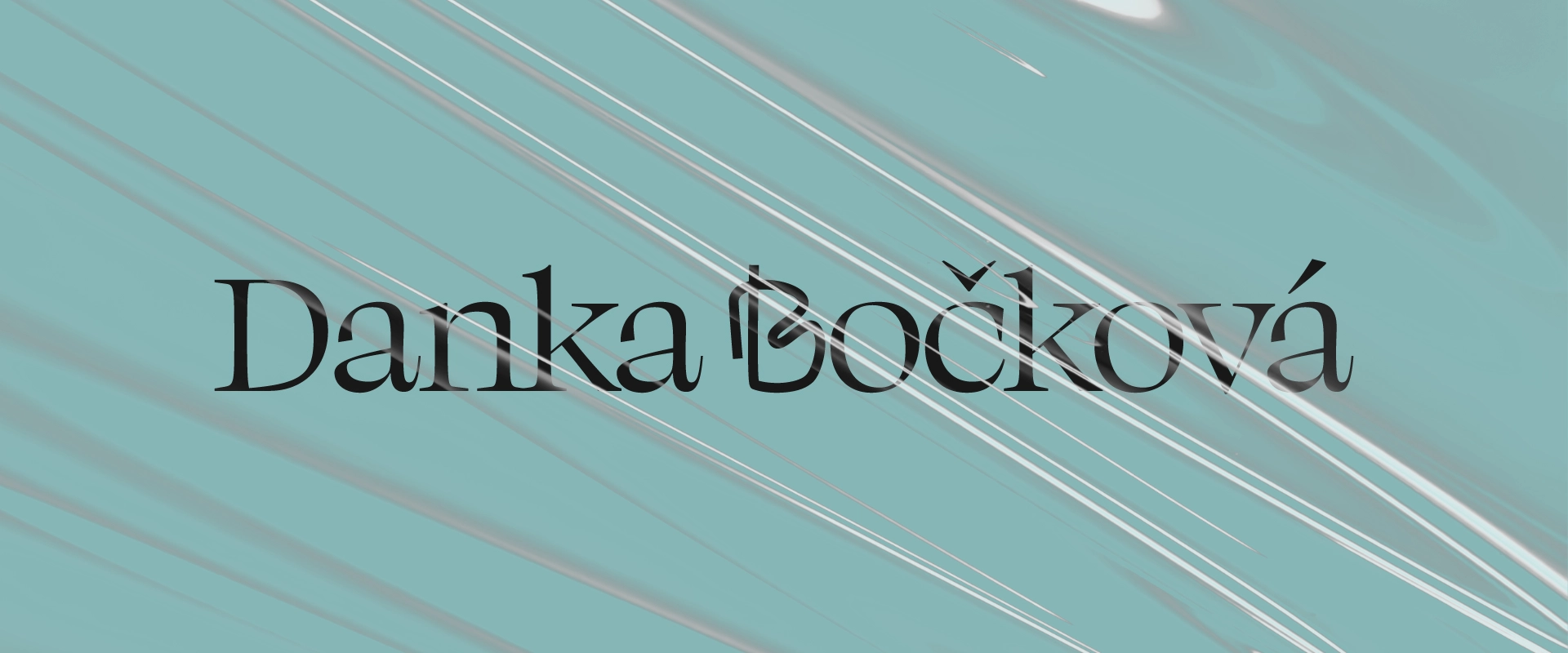
Decentná farebná paleta, serifové písmo a pattern, pripomínajúci čalúnenie doplnili do identity štýl komunikácie, ktorý je charakteristický a unikátny..
The design of the Danka Bočková Accountancy brand was a unique process that was created from a single paper clip.
I was sitting in the office bending a paper clip in my hand while talking about the new brand. After a time of bending, the letter B was formed from the paperclip, the initial, which became the symbol of the Danka Bočková Accountancy office.
Subtle color palette, serif font and pattern reminiscent of upholstery added to the identity a style of communication that is characteristic and unique.