-
MILEVA PILATES
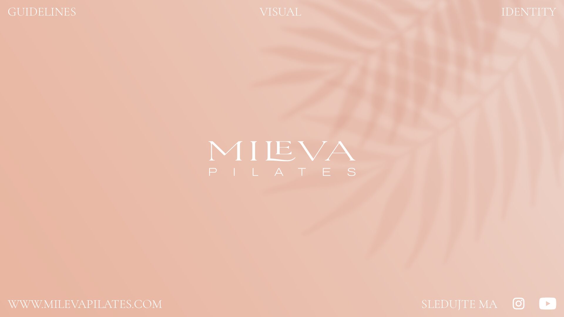
Design značky MILEVA PILATES, ktorá patrí Dorke, trénerke pilates, vychádza z myšlienky zdravého a aktívného života. Cítiť sa skvele, vo svojom tele. Kombinácia zdravia a pohybu sa v tvorbe značky a identity nastavila pomocou variácie typografie (písma). Aby značka bola verná majiteľke, primárnu farbu Dusty Pink definovala sama Dorka. Farebnosť sa doplnila o tiene rastlín,…
-
BIOTECO

Design značky BIOTECO pre medzinárodnú spoločnosť, ktorá pomocou technológie skvalitňuje životné podmienky. Inšpirácia pri tvorbe značky vychádza z kombinácie technológie, procesu a vody. Vizuálne zobrazenie procesu vo forme špirály vytvorilo špecifické písmeno O, ktoré v názve vytvára poznávací tvar značky, symbol. Špirála doplnila názov, a vytvorila logo značky BIOTECO. Vizuálny štýl využíva odtiene modrej farby,…
-
DARGAJ WOOD, Website
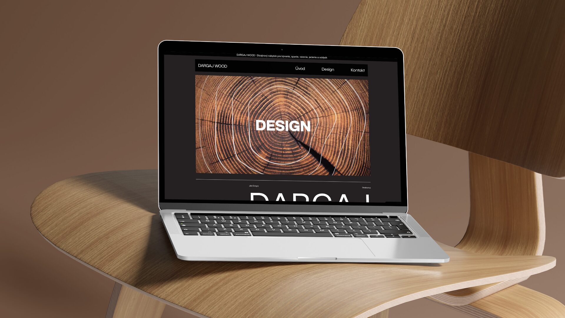
www.dargaj.sk Webová stránka pre značku DARGAJ WOOD je kľúčová digitálna aplikácia značky, ktorá spája katalóg produktov, prezentáciu služby a kontaktné informácie. Jednoduchú stavbu webu tvoria tri hlavné stránky, Úvod (Landing page), Design (Katalóg produktov) a Kontakt (Informácie). Štýl webstránky, ktorý vychádza z vizuálnej identity pomáha budovať vyššiu poznateľnosť grafických prvkov ako sú logo, farby a…
-
Účtovníctvo Danka Bočková, Website
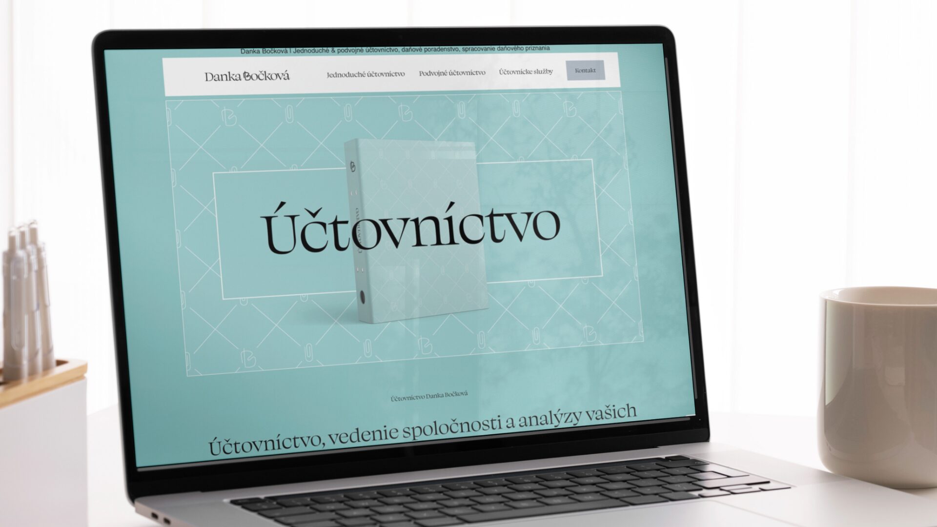
www.bockova.sk Landing page pre Účtovníctvo Danka Bočková bola vytvorená pre potreby digitálnej komunikácie služieb a značky firmy. Webová stránka sa skladá z hlavnej úvodnej stránky a podstránky kontaktu. Obsahová časť webstránky je navrhnutá tak, aby priamo a jednoducho komunikovala služby účtovníctva a kontaktných informácií. Aby webstránka budovala vyššiu poznateľnosť, je vizuálna časť navrhnutá z novej…
-
DESTINO

Design značky DESTINO, cestovnej kancelárie pre golfové a zážitkové výlety. Inšpiráciou procesu bolo cestovanie, ktoré som vizuálne navrhol do tvaru kompasu, strelky, ktorá rovnako pripomína hviezdu a slnko. K symbolu pribudlo písmo Red Rose, ktoré vizuálne dopĺňa tón značky a systém komunikácie služby. https://patrikcaky.sk/wp-content/uploads/2024/04/9×16-DESTINO-Motion.mp4 Design of the DESTINO brand, a travel agency for golf and…
-
HMYZOMLSKY

HMYZOMLSKY je projekt slovenskej akadémie vied a spoločnosti Scientica s.r.o., pre ktorý som mal tú česť navrhnúť design novej značky a nastavenie vizuálnej identity. HMYZOMLSKY je prvá farma kŕmneho hmyzu na Slovensku, ktorá dostala od veterinárov zelenú! V ich ponuke nájdete nielen živý kŕmny hmyz, ale aj kvalitné organické hnojivo z hmyzieho trusu. Vlnkovito usporiadané…
-
Package Collection Vesantech
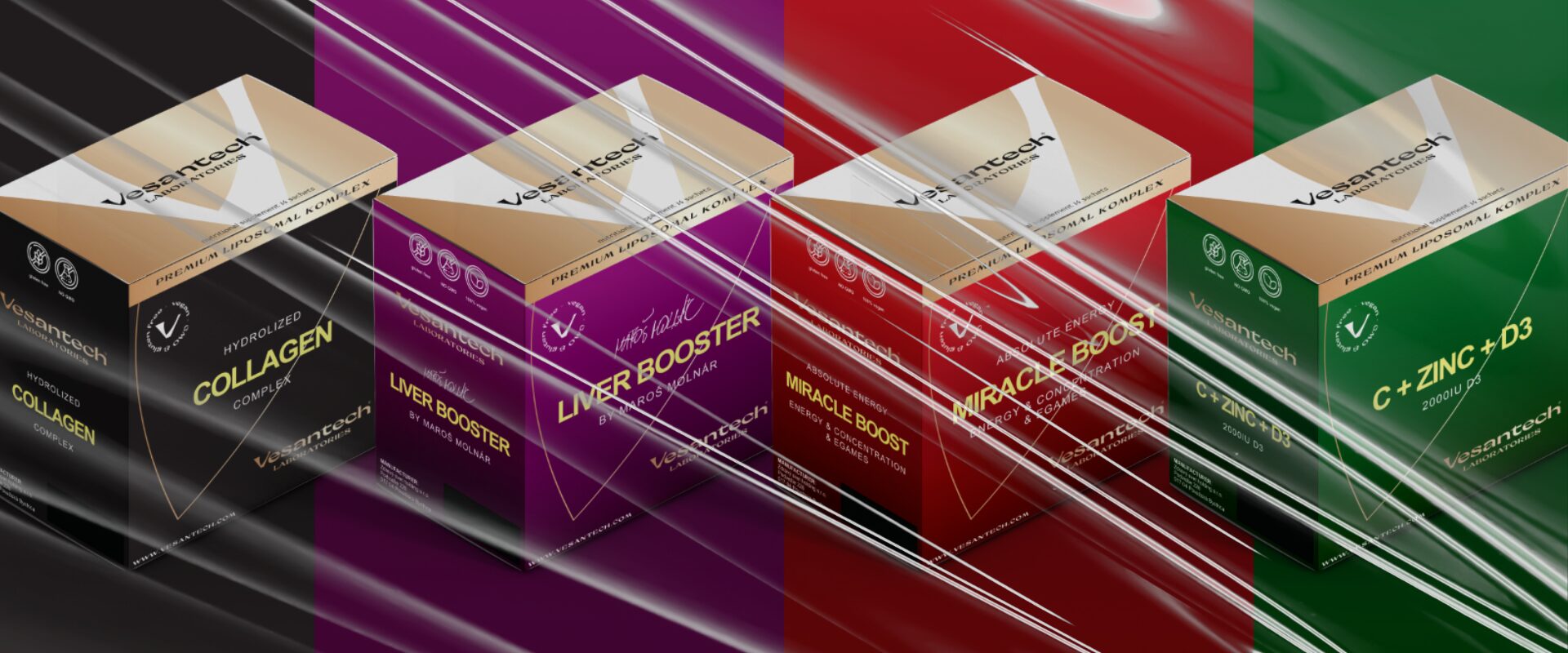
Obalový design pre Lipozomálne vitamíny od značky Vesantech, pre ktoré som vytvoril variabilný package design, ktorý dokáže odprezentovať nové produkty a balenia značky Vesantech. Inšpirácia a nápad pri tvorbe obalov vychádza z prvkov a symbolov vizuálnej identity samotnej značky. Packaging design for Liposomal vitamins from the Vesantech brand, for which I created a variable package…
-
Event Advisor Web Design
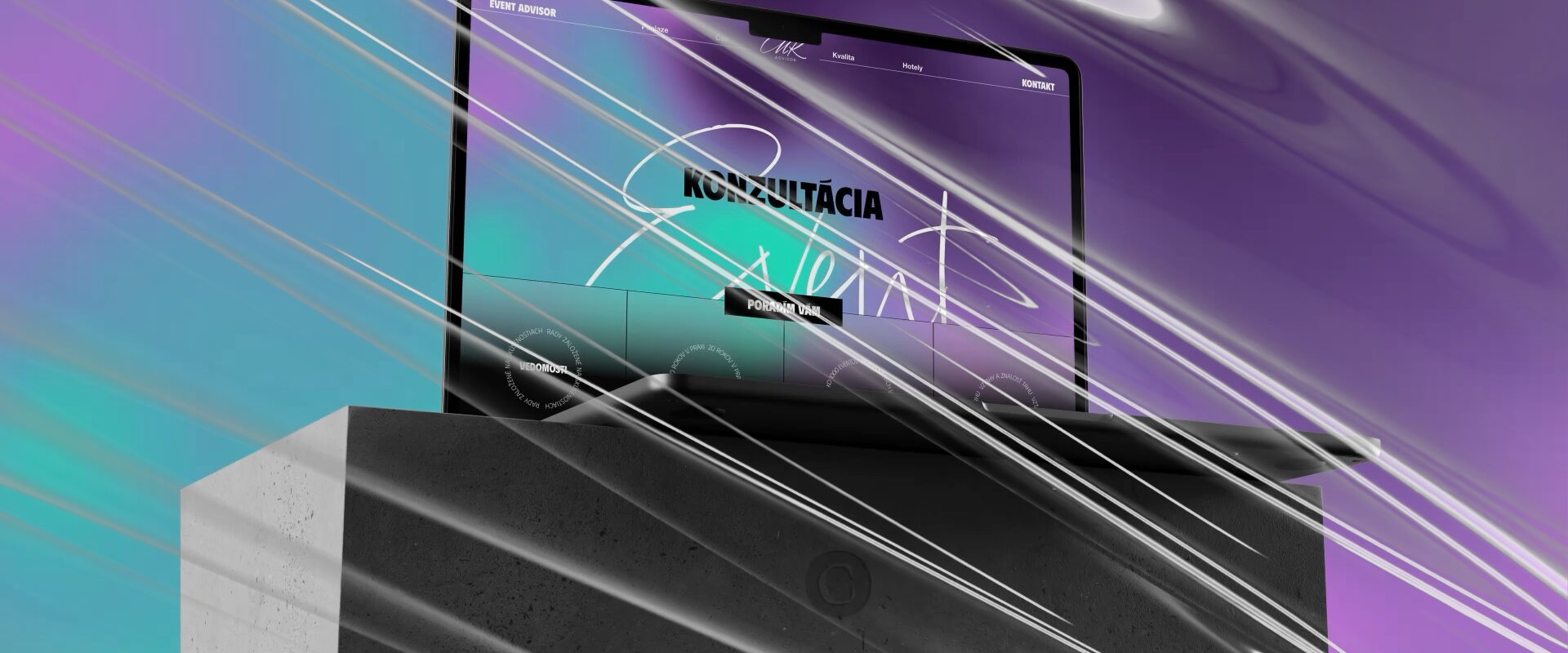
Design webovej stránky pre eventového poradcu Milana Kováčika. Nosnou myšlienkou pri tvorbe designu stránky bol folder, zakladač informácií, skúseností a kontaktov. Ideu zakladača som zapracoval do štruktúry, rozloženia a designu web stránky. Design sa vizuálne doplnil o kombinovanú, expresívnu typografiu a gradientové pozadie, ktoré vytvárajú celkový imidž webovej stránky. Website design for event consultant Milan…
-
KLIQ
Design značky KLIQ pre eshop prémiových alkoholických nápojov vznikol z inšpirácie typografických etikiet a tvaru fľaše. Vytvorením ligatúry “Li” vznikol symbol značky, fľaša, ktorá sa doplnila o voskový odtlačok, ktorý sa využíva ako grafický prvok vizuálnej identity značky KLIQ. Odtlačok (stamp) v podobe výraznej línie/obrysu je kombinácia vintage prvku v modernom šate. https://patrikcaky.sk/wp-content/uploads/2024/04/9×16-KLIQ-Motion.mp4 The design…
-
DARGAJ WOOD
Pod značkou DARGAJ WOOD vzniká nábytok vysokej kvality materiálom a spracovaním. Pri tvorbe symbolu značky som čerpal inšpiráciu v stodole plnej dreva vyššieho ako som ja sám. Letokruhy sa stali ideou symbolu, ktoré som doplnil o inciálu (písmeno) D ako referenciu na slová DARGAJ, DESIGN a WOOD. K symbolu som doplnil kruhovo usporiadanú typografiu BC…
Patrik Čaky // Logo – Design – Identity