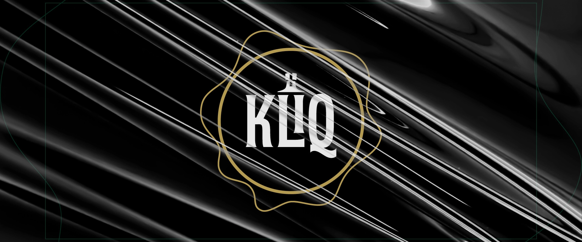
Design značky KLIQ pre eshop prémiových alkoholických nápojov vznikol z inšpirácie typografických etikiet a tvaru fľaše.
Vytvorením ligatúry “Li” vznikol symbol značky, fľaša, ktorá sa doplnila o voskový odtlačok, ktorý sa využíva ako grafický prvok vizuálnej identity značky KLIQ. Odtlačok (stamp) v podobe výraznej línie/obrysu je kombinácia vintage prvku v modernom šate.
The design of the KLIQ brand for the e-shop of premium alcoholic beverages was inspired by typographic labels and the shape of the bottle.
By creating the „Li“ ligature, the brand symbol was created, the bottle, which was completed with a wax impression, which is used as a graphic element of the visual identity of the KLIQ brand. A stamp in the form of a distinct line/contour is a combination of a vintage element in a modern dress.
Pod značkou DARGAJ WOOD vzniká nábytok vysokej kvality materiálom a spracovaním. Pri tvorbe symbolu značky som čerpal inšpiráciu v stodole plnej dreva vyššieho ako som ja sám.
Letokruhy sa stali ideou symbolu, ktoré som doplnil o inciálu (písmeno) D ako referenciu na slová DARGAJ, DESIGN a WOOD.
K symbolu som doplnil kruhovo usporiadanú typografiu BC Novatica, ktorá v kombinácii s čiernobielou paletou a technickými linkami vytvára vizuálnu identitu značky DARGAJ WOOD.
Under the DARGAJ WOOD brand, furniture of high quality material and processing is created. When creating the brand symbol, I drew inspiration from a barn full of wood taller than myself.
The tree rings became the idea of the symbol, which I completed with the initial (letter) D as a reference to the words DARGAJ, DESIGN and WOOD.
I added to the symbol the circular BC Novatica typography, which in combination with the black and white palette and technical lines creates the visual identity of the DARGAJ WOOD brand.
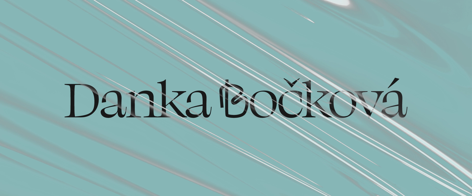
Design značky Účtovníctvo Danka Bočková bol unikátny proces, ktorý vznikol z jednej sponky.
Pri rozprávaní o novej značke som sedel v kancelárii a ohýbal som spinku v mojej ruke. Po čase ohýbania zo spinky vzniklo písmeno B, iniciála, ktorá sa stala symbolom kancelárie Účtovníctvo Bočková.
Decentná farebná paleta, serifové písmo a pattern, pripomínajúci čalúnenie doplnili do identity štýl komunikácie, ktorý je charakteristický a unikátny..
The design of the Danka Bočková Accountancy brand was a unique process that was created from a single paper clip.
I was sitting in the office bending a paper clip in my hand while talking about the new brand. After a time of bending, the letter B was formed from the paperclip, the initial, which became the symbol of the Danka Bočková Accountancy office.
Subtle color palette, serif font and pattern reminiscent of upholstery added to the identity a style of communication that is characteristic and unique.
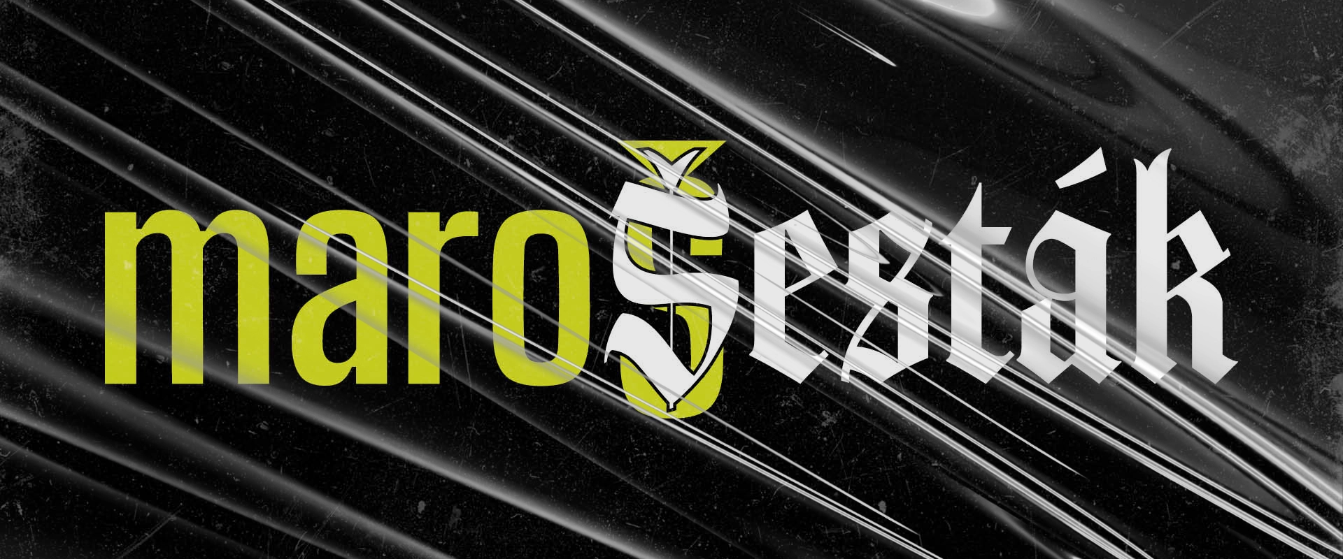
Personal branding pre vizuálneho umelca Maroša Šestáka, ktorému som vytvoril značku a nastavil vizuálnu identitu. Idea identity vznikla z mena a práce umelca. Spojením opakujúceho sa písmena Š, ktoré je na konci mena a začiatku priezviska, vznikol symbol “Double Š”.
Kombináciou sansového (digital) a gotického (artist) písma vzniklo logo značky maroŠeták. Ako bonus som otočením spodného Š o 90 stupňov vytvoril symbol kamery.
Visual Identity 4 Visual Artist. Personal branding for visual artist Maroš Šesták, for whom I created a brand and set a visual identity. The idea of identity arose from the name and work of the artist. The symbol „Double Š“ was created by combining the repeating letter Š, which is at the end of the name and the beginning of the surname.
The maroŠeták brand logo was created by combining Sans (digital) and Gothic (artist) fonts. As a bonus, I rotated the bottom Š by 90 degrees to create a camera symbol.
Design značky pre rezervačný a prezentačný nástroj APPONIO, ktorý užitočne pomáha podnikaniu a službám s rezerváciou zákazníkov a prezentáciou svojich služieb na jednom mieste.
Idea transformácie offline rezervácie na digitálny booking bola inšpirácia pre tvorbu designu značky. Kombináciou stuhy zo zápisnej knihy a symbolu dokončenia / potvrdenia (fajky) vznikol symbol značky APPONIO.
Symbol sme postavili na piedestál, a tak vznikla iniciála A. Následne som vytvoril aj ostatné písmená a vzniklo logo značky APPONIO.
Brand design for the booking and presentation tool APPONIO, which usefully helps businesses and services with customer reservations and presentation of their services in one place.
The idea of transforming an offline reservation into a digital booking was the inspiration for creating the brand’s design. The combination of the ribbon from the record book and the completion / confirmation symbol (check mark) created the APPONIO brand symbol.
We put the symbol on a pedestal and that’s how the initial A was created. Subsequently, I also created the other letters and the APPONIO brand logo was created.
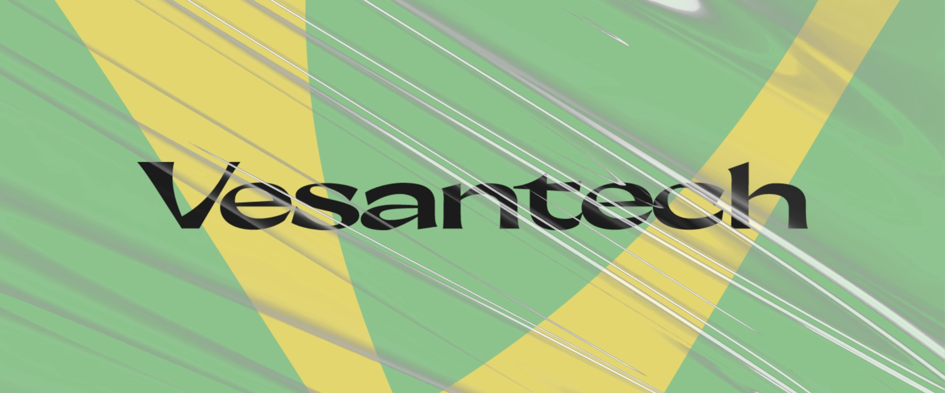
Design značky Vesantech je odkazom na vývoj lipo vitaminov a zdravý život.
Symbolom zdravých vitamínov značky Vesantech sa stala iniciála V, ktorej negatívny priesor vyplnil organický tvar listu, čo je odkazom na prírodu a naše zdravie.
Prírodné a olejové farby v spolupráci s charakteristickou typografiou a oragnickými tvarmi nastavili štýl komunikácie značky Vesantech.
The design of the Vesantech brand is a reference to the development of lipo vitamins and a healthy life.
The symbol of Vesantech’s healthy vitamins has become the initial V, whose negative dimension filled the organic shape of the leaf, which is a reference to nature and our health.
Natural and oil colors in cooperation with characteristic typography and organic shapes set the communication style of the Vesantech brand.
Redesign značky nemusí znamenať zahodenie starého a tvorbu nového, ale aj úprava starého k lepšiemu. Základom redesignu značky GROTTO bolo zjednotenie vizuálnej komunikácie, ako aj napríklad jednotná farebnosť & tvar loga v aplikáciách. Staré logo sa doplnilo o tvar bagety, ktorá zlepšila funkčnosť a poznateľnosť značky GROTTO.
Nový design vizuálnej komunikácie značky GROTTO bol hlavne inšpirovaný hladom. Nový zig-zag tvar, ktorý je asociáciou pôžitku hladného trhania obalu definoval nielen nový symbol. Tvar trhania v kombinácii s odvážnou typografiou, opakujúcimi sa vzormi a farebnosťou produktov definovali nový základ vizuálnej identity značky GROTTO. 🥖🥪😋 Pôžitok z plnej chuti.
Vytvorenie nového designu pre obaly produktov značky GROTTO bola zábavná kreatívna spolupráca. Práve z nej vznikol vizuálny systém, ktorý dokáže zlepšiť poznateľnosť a odlíšiteľnosť produktov na trhu a medzi ľuďmi, ktorí nestíhajú život.
Brand redesign doesn’t have to mean throwing away the old and creating a new one, but also modifying the old for the better. The basis of the redesign of the GROTTO brand was the unification of visual communication, such as uniform color & shape of the logo in applications. The old logo was supplemented with the shape of a baguette, which improved the functionality and recognition of the GROTTO brand.
The new visual communication design of the GROTTO brand was mainly inspired by hunger. The new zig-zag shape, which is an association of the pleasure of tearing open the packaging, defined not only a new symbol. The tearing shape combined with bold typography, repetitive patterns and colorful products defined the new basis of GROTTO’s visual brand identity. 🥖🥪😋
Creating a new design for GROTTO product packaging was a fun creative collaboration. It is precisely from this that a visual system was created, which can improve the recognizability and distinctiveness of products on the market and among people who can’t keep up with life.
Nový design značky KRAVA&Company vznikol zjednotením vizuálnej komunikácie, ktorá dokáže zlepšiť poznateľnosť a komunikáciu značky / produktov.
Prakticky a vizuálne oddeľuje komunikáciu výrobcu a produktov, čo je základ pre vznik ďalších nových subbrandov a produktov. Vizuálny štýl opisuje prirodzené postupy a guráž značky. Základom sa stala výrazná kopýtková typografia a tradičný tvar farmárskej ceduľky, ktorý tvorí logo značky. S tým sa flexibilne pracuje naprieč celou komunikaciou značky a produktov.
The new design of the KRAVA&Company brand was created by unifying visual communication, which can improve recognition, communication of the brand & products.
It practically and visually separates the communication of the manufacturer and products, thereby providing the basis for the creation of other new sub-brands and products. The visual style describes the natural processes and guts of the brand. The basis is a distinctive serif typography and the traditional shape of a farm sign, which forms the brand’s logo. This is used flexibly across all brand and product communication.
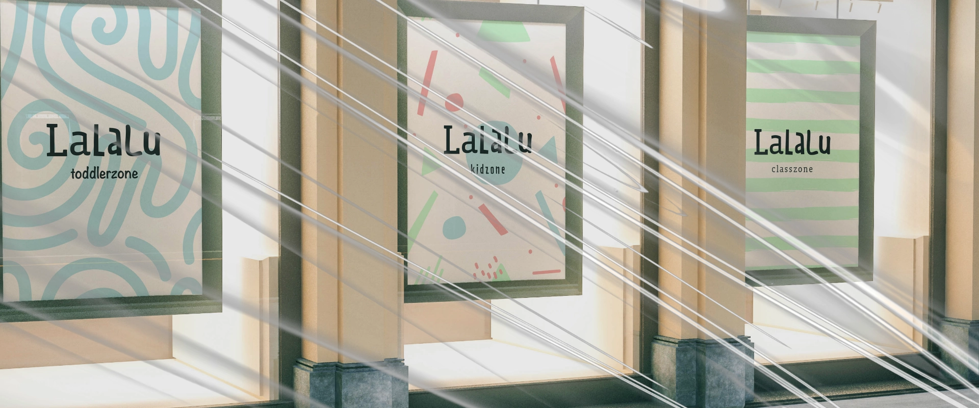
Design vizuálnej identity pre LaLaLu kidscafé, prvá kaviareň z kórejského konceptu “kidscafé” v nákupnom centre Parndorf, Rakúsko. Identita kombinuje poznateľnosť, učenie tvarov & hravosť detí.
Visual identity design for LaLaLu kidscafé, the first cafe from the Korean concept „kidscafé“ in the shopping center Parndorf, Austria. Identity combines recognizability, learning shapes & children’s playfulness.
Design značky lízingovej spoločnosti RS LEASE, ktorá prenajíma rušne na Slovensku a v Českej republike.
Vytvoril som písmo “Rolling Stock Regular”, ktorého typeface je dizajnovaný špecifickým charakterom, ktorý bol inšpirovaný vlakovou prepravou. Unikátnosť písma prináša značke a lepšiu poznateľnosť na trhu.
Brand design of the leasing company RS LEASE, which leases locomotives in Slovakia and the Czech Republic.
I created the font „Rolling Stock Regular“, whose typeface is designed with a specific character that was inspired by train transportation. The uniqueness of the font brings the brand and better recognition on the market.